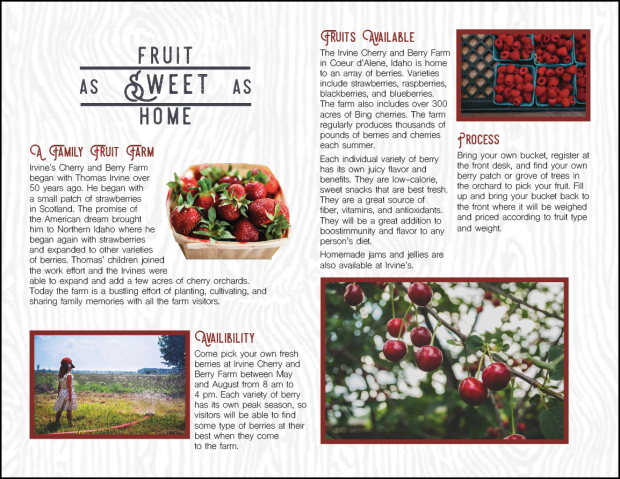

- Description: This is a brochure for a fruit farm where you can pick your own fresh berries and cherries.
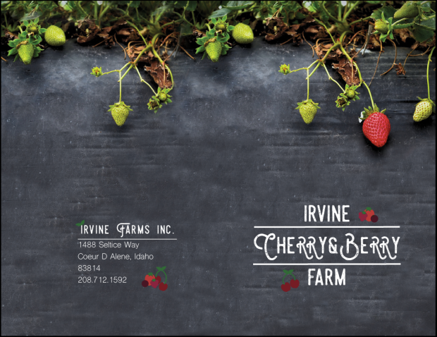
- Process (Programs, Tools, Skills): I used Adobe Illustrator to create the logo that was used on the front cover and the berries on the back cover as well. I used Adobe Indesign to create a duplex layout. I decided to keep it really simple and have a single half fold. I found images from unsplash.com and google.com to use on the inside and outside. Two images are full-bleed images, and four other images are used on the inside. I created a text wrap with the strawberry image on the first interior page. I went through the most challenges with creating the right file/image size. I wrote the entire body copy as well for this fictional fruit farm.
- Message: This brochure advertises for visitors to come pick and enjoy their own fresh fruit.
- Audience: I tried to create it to appeal to a family audience.
- Top Thing Learned: I learned a lot about alignment and sizing.
- Color scheme and color names: Complementary, red and green (with the contrasting neutrals, charcoal and white)
- Title Font Name & Category: Steelworks Vintage Demo, decorative
- Copy Font Name & Category: Shree Devanagari 714, sans serif
- Word Count of copy: 301
- Thumbnails of Images used:
- Sources (Links to images on original websites)
Cherries – unsplash.com, Logo – self created, Girl in field – Pexels.com, Raspberries – unsplash.com, Strawberries – unsplash.com, Strawberry background – unsplash.com, Woodgrain texture – franticstamper.com


I love your design! it looks so professional and fun at the same time. The color scheme you chose fits perfect for the company you created. I also love the pictures you incorporated and how it looks with the whole design. I also liked the flow of your brochure. You should cheak out ericka’s design as well. https://lagebyui.wordpress.com/2016/07/10/project-8-brochure/
LikeLike