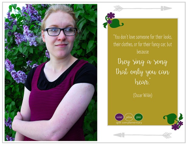
- Description: This is a photodesign project using photoshop to create a layout featuring my own photography and practicing my typography and color scheme skills.
- Process (Programs, Tools, Skills, FOCUS principles): I used a Nikon camera to take the photo, then used Photoshop to edit and enhance the photo. I started my first draft as a full-bleed of the photo and the quote aligned down the right side, but that was hard to read and felt crowded. Then during my critiques we thought it would be effective to change the layout to a landscape so I would have more space for design elements. That helped the flow and rhythm and balance between the photo and the quote. I tried to add the flowers and leaves as repetition from the photo. It was hardest to balance color values for this color scheme.
- Message: I wanted to communicate the natural beauty and connection we have with people, regardless of what they own in possessions, because that is something I associate with the subject of my photo, who is a close personal friend.
- Audience: My audience would be a youthful, young adult audience who may relate to the message of my design.
- Top Thing Learned: I learned that sometimes you have to think outside of the box. I was confining myself to a full-bleed photo with overlaid typography, but by turning it horizontal I was able to use more space to design. I also learned a lot from using this color scheme, because I had to balance the color values so the combination didn’t look like “Barney.”
- Color scheme and color names: I used a split complementary color scheme of violet, green, and yellow.
- Title Font Name & Category: Frenchpress, sans serif
- Copy Font Name & Category: Daydreamer, script
- Thumbnail of original, unedited image inserted
- Date and location you took the photo(s): Photo was taken Tues. May 17, 2015 in Rexburg outside of the Presbyterian church on College Ave.

Great color scheme. I love the photo and you picked a place for all the colors to come out and be included. The quote is great and powerful. It truly leaves a lasting image in your mind and it helps create a feeling of togetherness.
Check out what megan has done on her blog its great. https://meganbrowningcommunications.wordpress.com/2016/05/21/project-3-photodesign/comment-page-1/#comment-11
LikeLike
I really like the color scheme you picked for your project, I enjoy split complementary colors you picked. The contrast in the photo between the model and her background is perfect. Beautiful model! I looked through your other photos for last week and she did an amazing job. Your quote is gorgeous and touching to the heart, I like how you kept the theme from the picture to the boarders.
LikeLike